


Cloneable tags
Description
The Hatch UI Kit is a comprehensive utility framework and UI kit that is designed to help you get started on your Webflow sites faster. This cloneable is made up of 2,200 low-level utility classes that cover everything from font sizing to spacing scales based on responsiveness. With the Hatch UI Kit, you can quickly and easily add professional and visually appealing elements to your website, saving you time and effort. This cloneable, created by Mackenzie Child, is categorized under the categories of UI Kit and Styleguide, and it comes with full documentation for each class that can be found at the provided URL. If you want to add the Hatch UI Kit to your website, this cloneable is a great choice. So why wait? Try the Hatch UI Kit today and see how it can enhance your website.
Related cloneables
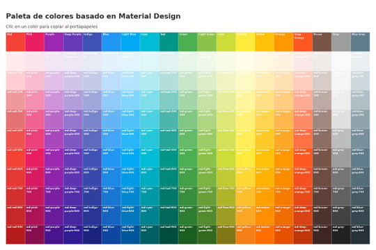


Here's a great project that shows all of Google's material color palette in an easy copy and paste method. Perfect for building color palettes for your site or finding inspiration for colors to utilize in your Webflow site.
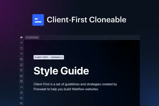

This is the official project starter cloneable for Client-First. It contains a style guide page with all the utility classes that come with the Client-First style system. What is Client-First? https://www.finsweet.com/client-first Full docs: https://www.finsweet.com/client-first/docs Made with 💪 by Finsweet
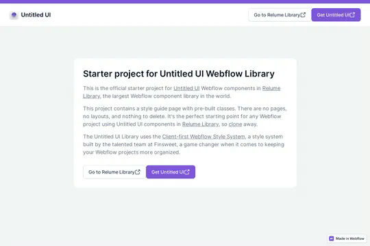

This is the official starter UI kit for the Untitled UI Webflow components library driven by Relume. This project contains a styleguide with all of the necessary pre-built classes. There are no pages, no layouts and nothing that you need to delete. This Untitled UI kit uses the client-first Webflow styling system. The styleguide features all typography, H1 headings, H2 headings all the way through H6 headings. This also includes the heading classes from xxlarge to xsmall, paragraphs, links, block quotes, unordered and ordered lists. You'll find the class text sizes such as text size large, text weights, text heights, text styles, color swatches, including error, warning and success color states. Background colors, text colors, shadows, UI buttons and all necessary elements, badges, badge groups, form elements such as inputs, dropdowns, checkboxs and radios. This is the complete Untitled UI styleguide kit to jump start your next Webflow builds.
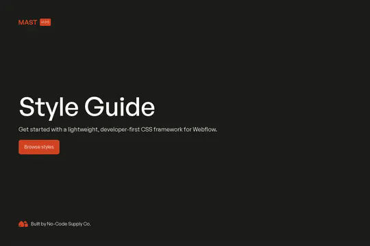

The Mast CSS framework is one of our favorite Webflow frameworks. It's based on a developer first mentality and features essential classes and strategies to help you build efficient Webflow sites. It's built with the less is more mentality, less classes, less elements to maintain which means faster sites and less development time. This framework allows you to quickly build anything from scratch by utilizing an essential set of HTML and CSS building blocks. Get up and running quickly with the Styleguide that features typography, heading classes, body text classes for paragraph, eyebrow text elements, ordered lists, unordered lists, color swatches, text colors, components such as buttons (primary, secondary, text links, form fields with radios and checkboxes, cards, utility classes, padding, alignment, overflow, size, helpers, layout, grids, columns and other helpful items.
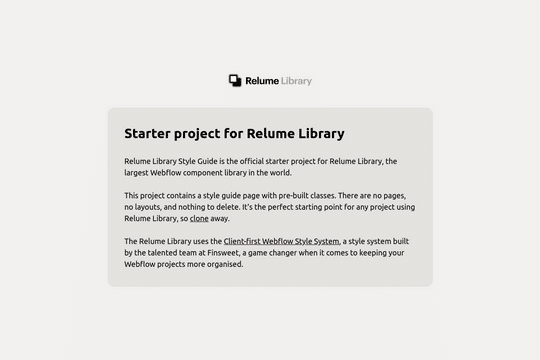

The starter style guide project for the Relume Library. This project contains a style guide with the necessary pre-built classes. There are no pages, no layouts, and nothing to delete. This simply allows you to get up and running with Relume, easily. The Relume Library uses Finsweet's client-first Webflow style system. You can find the prebuilt page under Drafts/Style Guide. The styleguide comes with Headings (H1-H6), heading classes (heading-xxlarge), Paragraphs, Links, Block Quotes, Lists, text sizes, text weights, letter spacing, line heights, text styles (using custom Global CSS), text alignment, rich text, colors, background colors, premade shadows, UI elements, buttons (with icons, alternates, icon locations), form elements, icons, image wrappers.
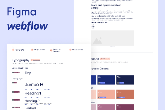

A wonderful style guide created by Flow Ninja. Jump start your Webflow build with this pre-built style guide. Includes a figma file, font styles, headings, block quotes, unordered lists, ordered lists, rich text elements, buttons, colors, inputs, containers, sections, paddings/sizing, margins, text alignment, flex and much more. This is a well organized styleguide featuring screenshots of the relevant sections if affects in Webflow. An excellent starting platform to build your own styleguide or use Flow Ninja's default styles.
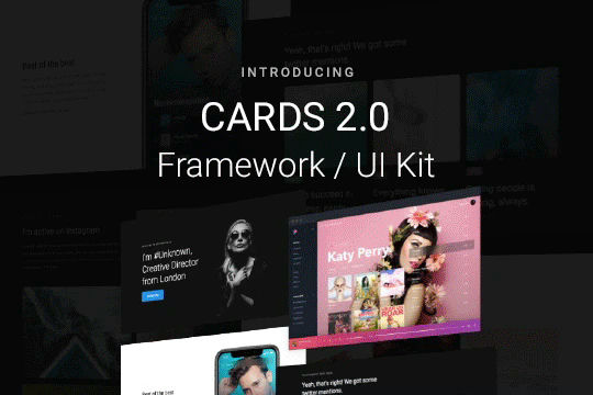

Cards 2 is an amazing UI kit and framework to allow you to quickly design and wireframe your next landing page using Webflow. There are over 100+ different prebuilt symbols and components included for hi-fidelity wireframing for any UI/UX designers. Create landing pages and designs faster with the Cards 2.0 UI kit directly in Webflow and ready to be published directly with code. This UI kit includes 50 new cards as Webflow components/symbols in both dark and light variations. 3 complete landing page designs in both dark and light. Symbols/components for both hero sections, features, testimonials, team, pricing pages, blog posts and more. These are responsive for all 4 breakpoints and all cards are offered in a Sketch file. This UI kit allows you to build your designs faster and begin the design process directly in Webflow.
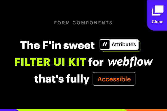
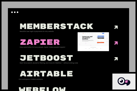
A full suite of wonderfully designed and accessible components for Finsweets Attributes CMS Filter and Webflow forms. Includes radio button, checkbox, dropdown, search input, select, range slider and more!

More from author
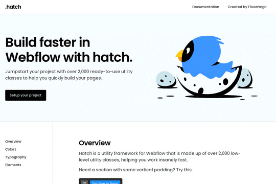
Hatch is a utility framework/UI kit that is made up of 2,200 low-level utility classes, allowing you to get started on your Webflow sites faster. From font sizing to spacing scales based on responsiveness. The documentation for each class can be found here: https://www.notion.so/Hatch-0d4a03cf6c9f474787e59484822d09c7
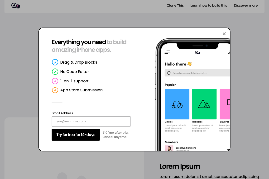
A beautifully designed opt-in/sign up modal interaction with Webflow that provides a unique way to sign people up or opt them in via an interaction. The modal has a custom bounce interaction on load and you can use the X or click anywhere on the page to close the box.