
Untitled UI Kit


Cloneable tags
Description
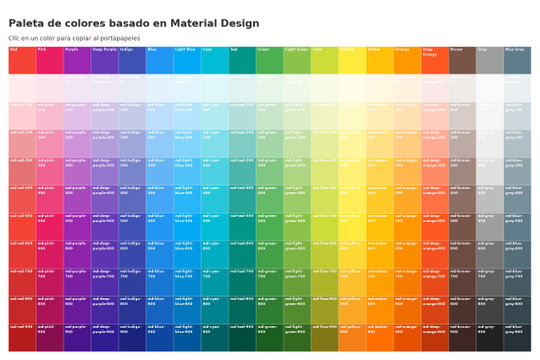
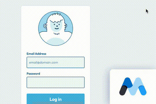
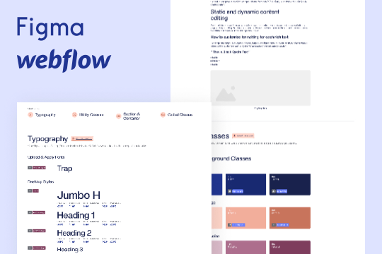
This is the official starter UI kit for the Untitled UI Webflow components library driven by Relume. This project contains a styleguide with all of the necessary pre-built classes. There are no pages, no layouts and nothing that you need to delete. This Untitled UI kit uses the client-first Webflow styling system. The styleguide features all typography, H1 headings, H2 headings all the way through H6 headings. This also includes the heading classes from xxlarge to xsmall, paragraphs, links, block quotes, unordered and ordered lists. You'll find the class text sizes such as text size large, text weights, text heights, text styles, color swatches, including error, warning and success color states. Background colors, text colors, shadows, UI buttons and all necessary elements, badges, badge groups, form elements such as inputs, dropdowns, checkboxs and radios. This is the complete Untitled UI styleguide kit to jump start your next Webflow builds.


