
The Top 24 Styleguide Webflow cloneables
Starter Webflow styleguide cloneables allow you to get up and running faster when building a new site in Webflow.
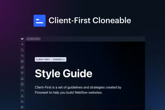


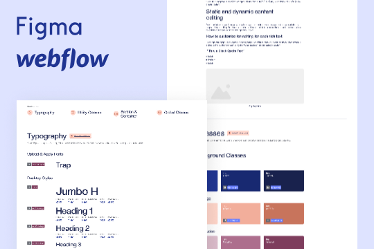
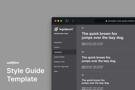
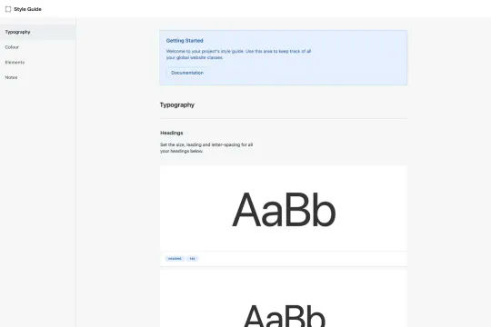
This is the official project starter cloneable for Client-First. It contains a style guide page with all the utility classes that come with the Client-First style system. What is Client-First? https://www.finsweet.com/client-first Full docs: https://www.finsweet.com/client-first/docs Made with 💪 by Finsweet
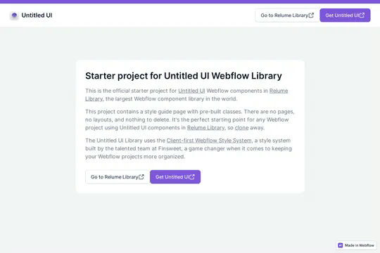

This is the official starter UI kit for the Untitled UI Webflow components library driven by Relume. This project contains a styleguide with all of the necessary pre-built classes. There are no pages, no layouts and nothing that you need to delete. This Untitled UI kit uses the client-first Webflow styling system. The styleguide features all typography, H1 headings, H2 headings all the way through H6 headings. This also includes the heading classes from xxlarge to xsmall, paragraphs, links, block quotes, unordered and ordered lists. You'll find the class text sizes such as text size large, text weights, text heights, text styles, color swatches, including error, warning and success color states. Background colors, text colors, shadows, UI buttons and all necessary elements, badges, badge groups, form elements such as inputs, dropdowns, checkboxs and radios. This is the complete Untitled UI styleguide kit to jump start your next Webflow builds.
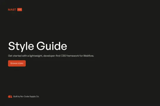

The Mast CSS framework is one of our favorite Webflow frameworks. It's based on a developer first mentality and features essential classes and strategies to help you build efficient Webflow sites. It's built with the less is more mentality, less classes, less elements to maintain which means faster sites and less development time. This framework allows you to quickly build anything from scratch by utilizing an essential set of HTML and CSS building blocks. Get up and running quickly with the Styleguide that features typography, heading classes, body text classes for paragraph, eyebrow text elements, ordered lists, unordered lists, color swatches, text colors, components such as buttons (primary, secondary, text links, form fields with radios and checkboxes, cards, utility classes, padding, alignment, overflow, size, helpers, layout, grids, columns and other helpful items.
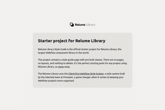

The starter style guide project for the Relume Library. This project contains a style guide with the necessary pre-built classes. There are no pages, no layouts, and nothing to delete. This simply allows you to get up and running with Relume, easily. The Relume Library uses Finsweet's client-first Webflow style system. You can find the prebuilt page under Drafts/Style Guide. The styleguide comes with Headings (H1-H6), heading classes (heading-xxlarge), Paragraphs, Links, Block Quotes, Lists, text sizes, text weights, letter spacing, line heights, text styles (using custom Global CSS), text alignment, rich text, colors, background colors, premade shadows, UI elements, buttons (with icons, alternates, icon locations), form elements, icons, image wrappers.

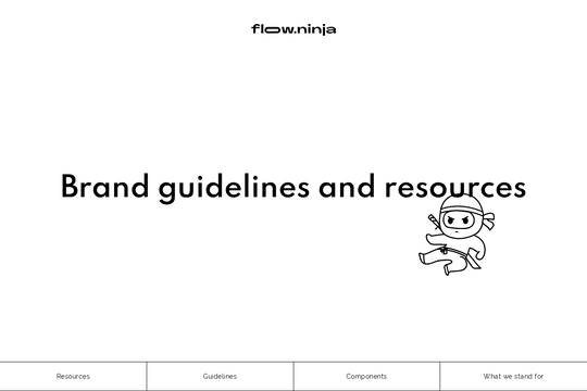
A wonderful style guide created by Flow Ninja. Jump start your Webflow build with this pre-built style guide. Includes a figma file, font styles, headings, block quotes, unordered lists, ordered lists, rich text elements, buttons, colors, inputs, containers, sections, paddings/sizing, margins, text alignment, flex and much more. This is a well organized styleguide featuring screenshots of the relevant sections if affects in Webflow. An excellent starting platform to build your own styleguide or use Flow Ninja's default styles.
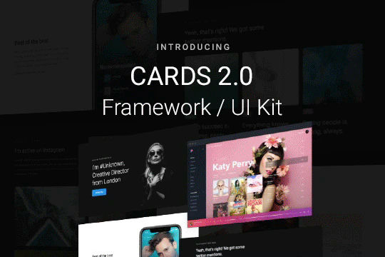

Cards 2 is an amazing UI kit and framework to allow you to quickly design and wireframe your next landing page using Webflow. There are over 100+ different prebuilt symbols and components included for hi-fidelity wireframing for any UI/UX designers. Create landing pages and designs faster with the Cards 2.0 UI kit directly in Webflow and ready to be published directly with code. This UI kit includes 50 new cards as Webflow components/symbols in both dark and light variations. 3 complete landing page designs in both dark and light. Symbols/components for both hero sections, features, testimonials, team, pricing pages, blog posts and more. These are responsive for all 4 breakpoints and all cards are offered in a Sketch file. This UI kit allows you to build your designs faster and begin the design process directly in Webflow.
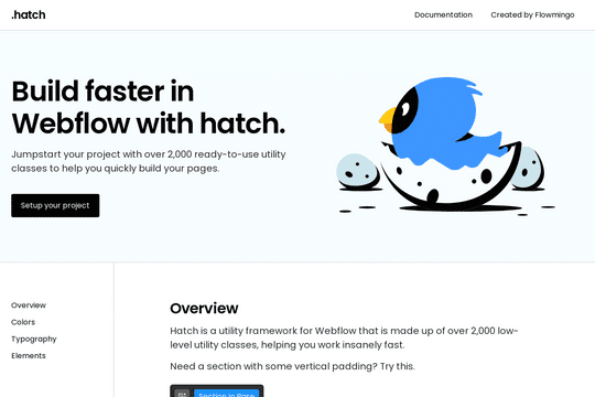

Hatch is a utility framework/UI kit that is made up of 2,200 low-level utility classes, allowing you to get started on your Webflow sites faster. From font sizing to spacing scales based on responsiveness. The documentation for each class can be found here: https://www.notion.so/Hatch-0d4a03cf6c9f474787e59484822d09c7

A style guide framework built in Webflow so that you can easily build and create a style guide for your projects/clients in Webflow. This framework lays out all the elements, tools, components and resources used to develop them. This is based on the client-first methodology by Finsweet.
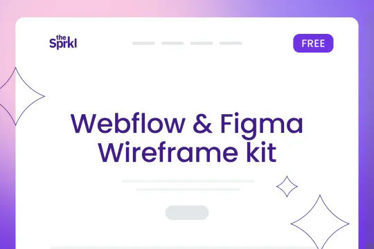
An extensive Webflow & Figma wireframe UI kit based on the Sprkl framework and full of complete components, blocks and sections to create unique designs. This UI kit features 2 menus/navbars, 2 hero sections, 4 different feature sections, 2 blog posts, 3 testimonial sections with sliders, a clients list area, form fields, accordion, 3 footers, 2 pricing tables, 1 call to action and 3 team sections. There's also a full styleguide section which includes H tags, individual text styles for pagaraph, text blocks, text links, block quotes. There are individual text styles, color swatches. This is a great starter wireframe kit to start building and creating in Webflow faster.
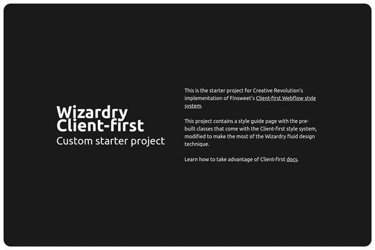

This is a styleguide combination of the Wizardry system and Finsweets Client first methodology. The Wizardry system is an em-based fluid scaling system that is combined with the first class structure and naming conventions of the client first class naming structure and conventions. The main area where the two systems are combined is in sticking with REM units for the small text elements so that on desktop they don't end up too small on low resolution screens. The design also has a mockup at 1440px and in the template the body font size is set to 1.111vw, which is equivelent to 16px for simple px to em conversion.

A fast and easy way to build your own styleguide in Webflow. This starter style guide is organized in one page and setup with the basics of all of the critical elements you'll need. There's also instructions that help you better understand how to create your own style guide in Webflow.

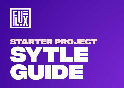
A styleguide for Timothy Ricks Wizardry technique in Webflow. This styleguide will add the core elements of the Wizardry technique to your Webflow site.

A style guide template that you can use to jumpstart your upcoming Webflow project and speed up your sites development time. There is a bit of custom code in the page settings. The CSS stops the default grey box flash from happening when you click the return to top button on mobile.

A basic styleguide for beginners. Includes font style demonstration, color palettes, text colors, display classes, headings, text blocks, paragraphs, rich text elements, buttons, links, form fields, checkboxes, radio icons, icons, logos, class codes and more.
Creating a proper Webflow site should start with brand guidelines and a style guide. This ensures that your sites brand and feel stays consistent from the start of your Webflow site build. This is a great resource and UI kit to build your own styleguide and brand guidelines.

Here's a great style guide template that you can clone to use, or modify for your own Webflow sites. It's built with a grid page and bootstraps 4 style columns. It includes a typography section, color palettes, button designs, form inputs and labels including checkboxes and radio buttons. Cards with shadows and much more.
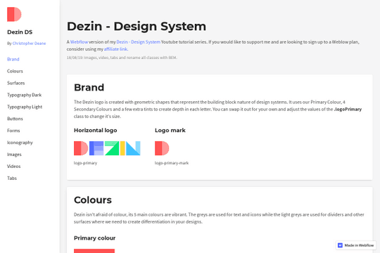

A free cloneable of the Dezin style guide for Webflow. This contains everything you'd need for your Webflow site, including color palettes, surfaces, typography, buttons, form inputs, iconography, images, video embeds and even tabs. This is a great way to kickstart your Webflow sites and build a faster, and more cohesive designs.

A template for building your own brand design system and/or styleguide created by 5Four Digital. A design system/style guide is a single source of truth which groups all of the design elements for development.
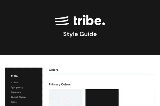

A thorough style guide based on tribe.so's brand and styling guides. This style guide includes colors, typography, structure, global classes, icons, forms, rich text and buttons in a well designed structure.

Here is a simple branding style guide that you can use for your Webflow projects and clients sites. This helps your clients, or yourself, create branding guidelines that will be used for all marketing and site materials.

A started style guide featuring many of the core elements needed when creating a Webflow site. This style guide features typography setting such as headings, text classes, labels or eyebrows, field labels and rich text. Color options such as text colors, text hovers, fill colors, border colors, form colors for both dark and light versions. Elements such as buttons, icon buttons, submit buttons, text links, inline links, pills, interface icons, text fields, text areas, checkboxes, radio buttons, select fields and dropdowns, containers and spacers as well as additional information about this style guide.
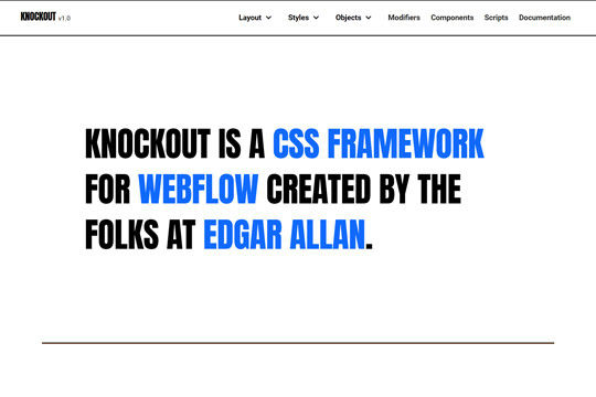

Knockup is an end to end Figma to Webflow framework created by Edgar Allan. It helps designers and Webflow designers accomplish more by working together via an easy to understand framework. This framework defines the approach that Edgar Allan uses for all projects, from single page sites to large scale enterprise arrangements.

A great style guide to get your Webflow site up and running faster. Included in this style guide is typography, hero text, H classes, paragraph, rich text, color swatches, buttons, shadows and more.

A free Webflow style guide featuring all of the fundamentals that you'd need to build a Webflow site. This includes backgrounds, buttons, cards, colors, elements, fonts, grids, icons, sections and much more. This styleguide was created to be a starting foundation of your Webflow site, ensuring that each element has it's own style guide element to keep consistency and brand continuity throughout your Webflow project.