


Cloneable tags
Description
A UI kit featuring dozens of helpful premade components perfect for your next project. These components include content cards, buttons, button hovers, navigation and site footers. There are six different content cards featuring designs perfect for blog posts, news items, products and more. There are 15 different button options and designs from rounded to square style buttons. This component UI kit also features 6 different hover interactions buttons with custom code embeds. Button animations such as floating buttons, underline, sweeps, wiggles and hover pops. There are also five different navigation bars perfect for any kind of template, there are also three different style footers.
Related cloneables
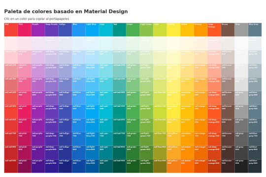


Here's a great project that shows all of Google's material color palette in an easy copy and paste method. Perfect for building color palettes for your site or finding inspiration for colors to utilize in your Webflow site.
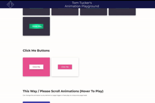

A huge selection of premade Webflow animations, including animated buttons, click buttons, circular hover buttons, scroll down animations, nav link animations, tab animations, search bars, social media buttons, text animations, contact cards, blog cards, product cards and more.
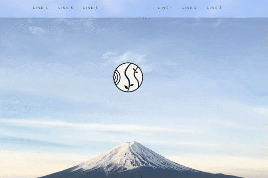

A unique way of showcasing your logo front and center and have it move up on page scroll in Webflow. This adds a fun dynamic element to your Webflow site and draws the users attention in. This interaction was created entirely from Webflow's native interactions using the While page is scrolling functionality and size, move, scale, opacity and more. This requires no additional custom code and can be cloned and setup quickly.


A wacky and fun button animation in which emoji's explode after clicking a button in Webflow. This effect was created using custom JS so be sure to add the code found in the page settings to your site in order for it to work properly. While this could be created natively with Webflow interactions a simple JS library helps create this effect faster and easier.

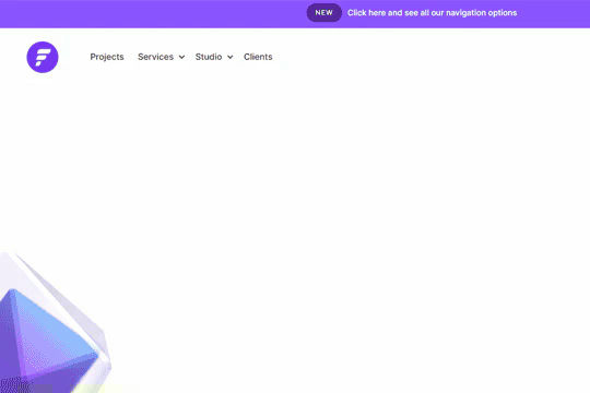
A fully cloneable mega menu navigation with full page dropdown interactions for Webflow. A great way to quickly get your Webflow menu/navigation launched with pre-built dropdowns, CTA buttons, and more. This was built with clear class names, native Webflow interactions, basic dropdown triggers and fully responsive.
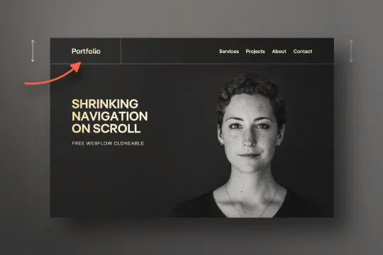

Have your navbar shrink on page scroll via this Webflow cloneable. Easily create dynamic navbars for your Webflow site that shrink upon scrolling down the page. Once a user reaches a certain point on the page the navbar transitions from dark to light while shrinking. This does not require any custom code and utilizes Webflow's native interactions. This utilizes Webflow's While scrolling in view for two different classes and as previously mentioned does not require any extra custom code. This cloneable is perfect for anyone looking to create a dynamic navbar that allows for dynamic changes based on the users scroll depth on the site.
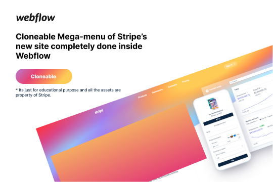

Here's a rebuild of Stripes mega menu design in Webflow. Add a unique mega menu design and navbar to your site inspired by Stripe's mega menu.
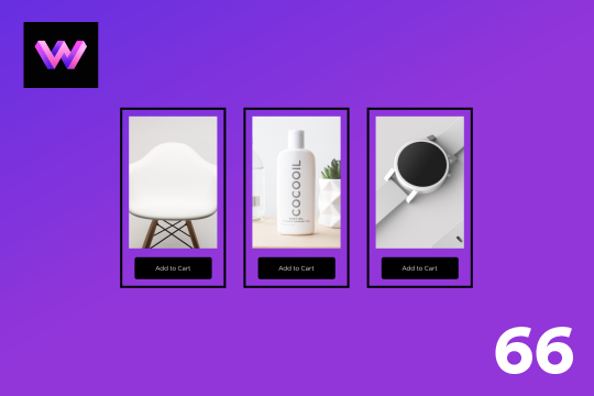

An add to cart hover button animation for Webflow. When a user hovers over the Add to Cart button a shopping cart icon slides in from the right side. This helps users understand the action taking place on the button and helps add a new level of dynamic buttons to your Webflow site.

More from author

An FAQ accordion for Webflow that includes all of the Webflow interactions to make it work. This accordion offers a simple design and is fully responsive with prebuilt interactions to make the magic happen.
A well designed starter dropdown navigation menu with hover over for Webflow. This consists of clear class names, 100% native interactions and basic dropdown triggers. It's also mobile friendly and responsive design.
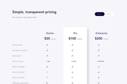
A wonderfully designed pricing comparison table with everything you'd need to showcase and feature a pricing page on your site.

Here's a beautifully designed rotating testimonial slider in Webflow. A great way to build trust with your prospective clients. This testimonial component will auto slide between your testimonials with a smooth transitioning effect.
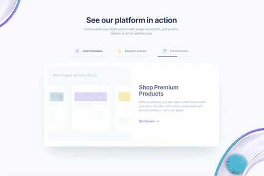
Power up your Webflow tabs through a timed, auto-rotating tabs feature. This is perfect to add emphasis to your Webflow tabs and more specifically demos, explainers, testimonials and just about everything else you can think of. This is a super simple script that adds auto rotation to Webflows native tabs.

Want to add smooth scrolling to your Webflow site? With this cloneable you'll be able to add smooth scrolling via luxy.js. Adding smooth scrolling doesn't need to be complicated and there are plenty of options to achieve this inertia type scroll effect although Luxy.js provides a great way to achieve this.
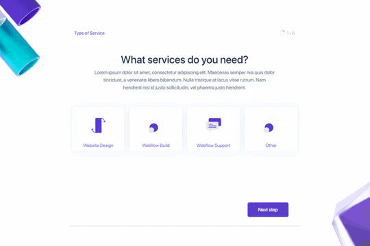
Here's a way to create a multi-step Webflow form that includes a step counter, custom confirmation animations and custom checkboxes. A perfect way to filter leads, create long forms that are filled out, and segment your lists/clients.
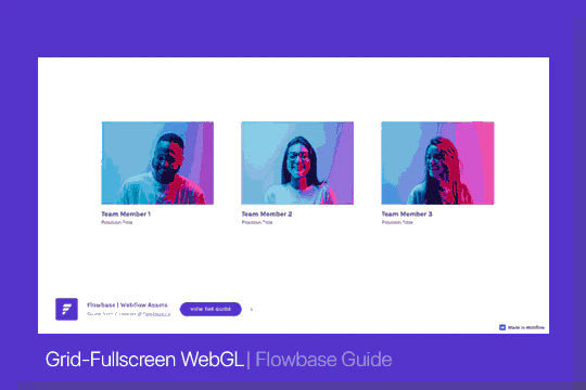
Here's a way of adding a unique, full screen image transition to your Webflow site via Three.js Each image loads a unique transition upon clicking them and turns the images full screen upon click.