
The Top 55 Menu Webflow cloneables
Premade Webflow menu cloneables that will get you up and running with an amazing menu in minutes.
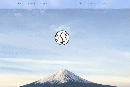


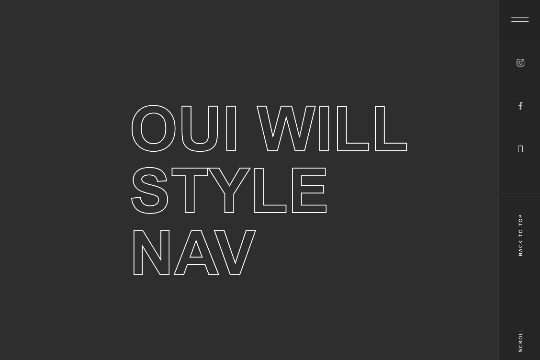
A unique way of showcasing your logo front and center and have it move up on page scroll in Webflow. This adds a fun dynamic element to your Webflow site and draws the users attention in. This interaction was created entirely from Webflow's native interactions using the While page is scrolling functionality and size, move, scale, opacity and more. This requires no additional custom code and can be cloned and setup quickly.

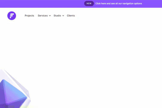
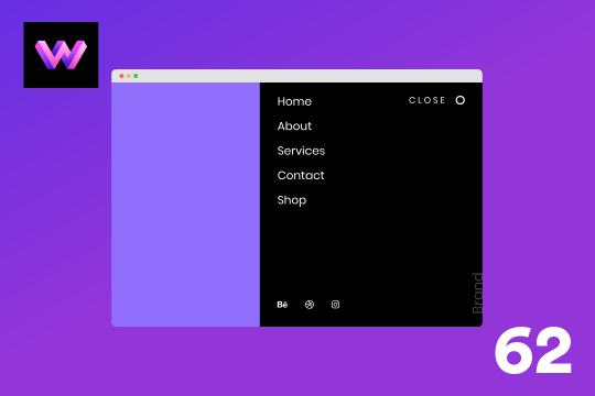
A fully cloneable mega menu navigation with full page dropdown interactions for Webflow. A great way to quickly get your Webflow menu/navigation launched with pre-built dropdowns, CTA buttons, and more. This was built with clear class names, native Webflow interactions, basic dropdown triggers and fully responsive.
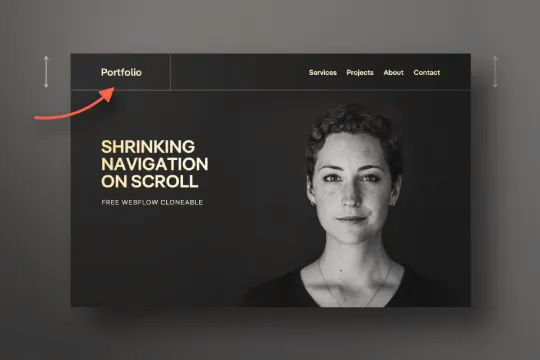

Have your navbar shrink on page scroll via this Webflow cloneable. Easily create dynamic navbars for your Webflow site that shrink upon scrolling down the page. Once a user reaches a certain point on the page the navbar transitions from dark to light while shrinking. This does not require any custom code and utilizes Webflow's native interactions. This utilizes Webflow's While scrolling in view for two different classes and as previously mentioned does not require any extra custom code. This cloneable is perfect for anyone looking to create a dynamic navbar that allows for dynamic changes based on the users scroll depth on the site.
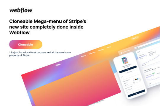

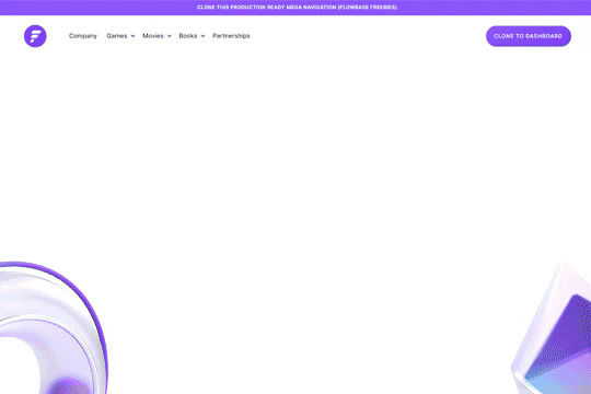
Here's a rebuild of Stripes mega menu design in Webflow. Add a unique mega menu design and navbar to your site inspired by Stripe's mega menu.
A well designed starter dropdown navigation menu with hover over for Webflow. This consists of clear class names, 100% native interactions and basic dropdown triggers. It's also mobile friendly and responsive design.


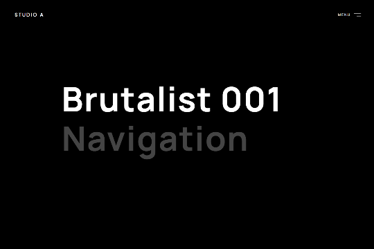
A very cool scrolling spiral menu text effect. Opens up a fun opportunity for a unique full screen menu build.


Here's a full screen menu navigation with animations and interactions in Webflow. This is a great way to easily add a menu/navigation to your Webflow site. This was comprised of three components during the build process. First, an image wrapper with an image inside of it. Second, the blue background and third a right wrapper with the menu items inside of it. The image wrapper and right wrapper are both 50% width within the menu. The width of the blue background is 150% so it has a quicker animation as it scales in. By having separate wrappers inside of the menu wrapper the scaling effect can also apply to the image, and the blue background as well as individual animations to the menu items. The menu trigger also turns into a close icon on click and then back to the hamburger button.
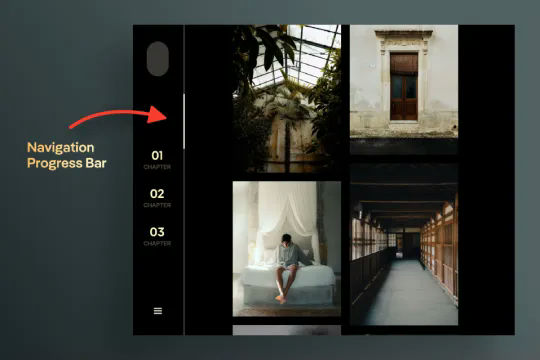
A unique vertical navbar with a page scroll progress bar for Webflow. This vertical navbar features a progress bar that indicates how far down the page the user is and was created entirely with Webflow interactions. Note there is some CSS however this controls hiding the browsers default scroll bar. Otherwise this was built and created entirely with Webflow interactions. Taking advantage of While page is scrolling a div is moved down the page based on the percentage of the page that the user has scrolled down. This is perfect for storytelling or blog posts or pages with a large amount of information. A wonderful vertical menu solution for Webflow.

Here's an interaction to shrink the navigation/menu on page scroll for your Webflow site.
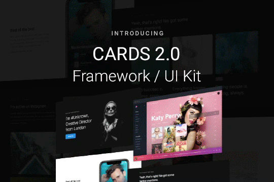

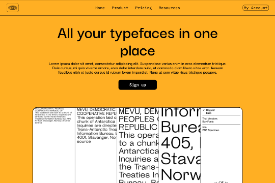
Cards 2 is an amazing UI kit and framework to allow you to quickly design and wireframe your next landing page using Webflow. There are over 100+ different prebuilt symbols and components included for hi-fidelity wireframing for any UI/UX designers. Create landing pages and designs faster with the Cards 2.0 UI kit directly in Webflow and ready to be published directly with code. This UI kit includes 50 new cards as Webflow components/symbols in both dark and light variations. 3 complete landing page designs in both dark and light. Symbols/components for both hero sections, features, testimonials, team, pricing pages, blog posts and more. These are responsive for all 4 breakpoints and all cards are offered in a Sketch file. This UI kit allows you to build your designs faster and begin the design process directly in Webflow.

Here's another well designed Webflow navigation menu bar with dropdown interactions. This nav menu is perfect cloneable to jump start your Webflow site builds by providing a fully functional, mobile friendly mega menu navigation to your Webflow site.

A full screen animated navigation with hover interactions and slide in animations.


Here's a well designed, full screen navigation menu with hover image interactions and slide in transitions for Webflow. A unique, classy styled navigation and menu that provides interactions when hovering over text links. The images change out and there are text effects.
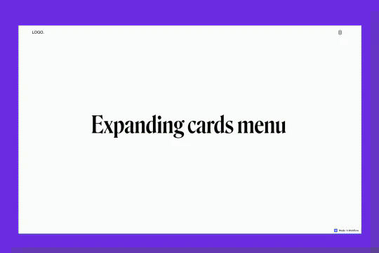
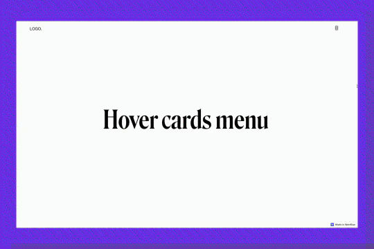
An example of an expanding image cards on hover menu and navbar in Webflow. This full page menu adds a hover interaction that expands cards or images on hover in your Webflow menu.


A fun, fully responsive slide in menu animation for your Webflow navigation. This menu slides in via a dynamic animation and more importantly is already mobile and responsive friendly.
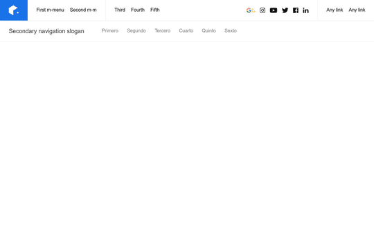

An easy way to add a mega menu navigation menu to Webflow. Features a dropdown menu with secondary navigation. This is perfect for a site with many different links needed within the menu. The menu is fully responsive and is managed via Symbols. You will find instructions within the designer cloneable.

An expiremental hamburger menu for Webflow with the interactions. This is a full screen, animated hamburger menu/navigation that you can easily add to your Webflow site.
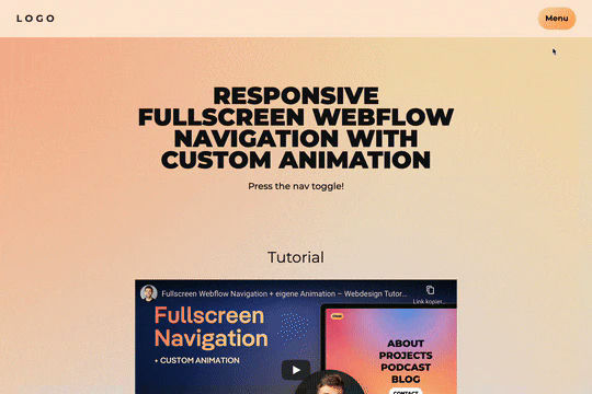
A fancy, full-screen responsive and mobile ready menu navigation. The custom open and close animation is with an animated background gradient that adds some uniqueness to the menu itself. View the youtube tutorial here:


Five different mega menu navigation designs for Webflow. This helps you add unique mega menu designs to your Webflow site that feature different mega menus dropdowns perfect for your site.
Here's a wonderfully designed mega menu navigation with dropdowns for Webflow. This mega menu is perfect to get your navigation built quickly for your Webflow site. Featuring multiple different dropdown styles, perfect for any Webflow project.

Three different unique menu nav bar designs for Webflow. The three designs feature unique hover dropdowns, buttons and designs for your Webflow site.
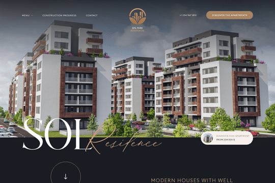

A real estate hero section design for Webflow. This hero features a custom load animation, call to action buttons, fully designed slide in menu/nav bar and much more. This features a JS snippet to disable scroll once the menu is open, which can be found in the home settings before the body tag.


Here are examples of multi-layered SVG shape overlays with generated animations for your Webflow site. There are several examples in this cloneable and provide good demonstration of how to use SVG shape overlays. Now you can easily modify the SVG colors in each pages custom code panel (header). Easily create a transition for your menu links. There are two demonstrations of ways to prevent multiple clicks and having the menu get out of sync via a Webflow interaction.
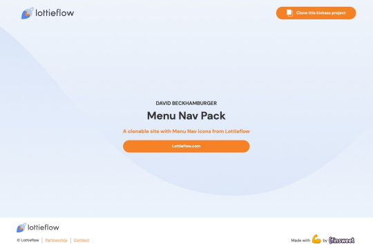

Over 20+ different lottie files perfect for the humburger or menu button of your navigation bar on Webflow. These unique menu nav lottie file icons are perfect for movements and animations of a hamburger button within your Webflow site.

A full page, dark themed, hamburger menu navigation for Webflow. Built with interactions and animations for sliding the menu in as well as hover states for the links.
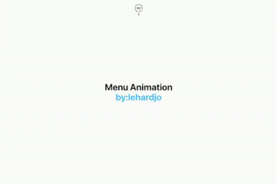

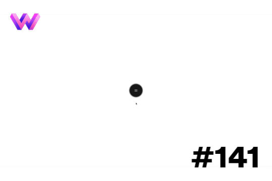
A unique animation for a menu/navigation in Webflow. When a user opens the menu it opens with an expanding circle animation to add a unique design flair to your Webflow navigation/menu.
Another amazing Webflow full screen menu featuring a hover over image preview interaction that allows for dynamic images to be presented. This Webflow interaction creates a fun, yet professional animation to your Webflow's menu.
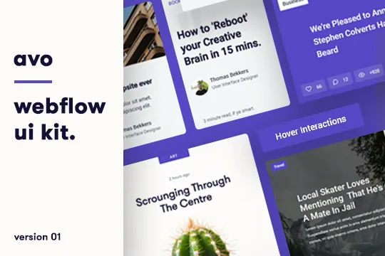
A UI kit featuring dozens of helpful premade components perfect for your next project. These components include content cards, buttons, button hovers, navigation and site footers. There are six different content cards featuring designs perfect for blog posts, news items, products and more. There are 15 different button options and designs from rounded to square style buttons. This component UI kit also features 6 different hover interactions buttons with custom code embeds. Button animations such as floating buttons, underline, sweeps, wiggles and hover pops. There are also five different navigation bars perfect for any kind of template, there are also three different style footers.
This demo showcases a technique of using a SVG/Lottie menu that comes in from the right to the left. The path was created in Illustrator and then animated with After Effects. This was then brought into Webflow and the animation was triggered alongside a menu opening interaction. Animations were also added for the open and close buttons.

A simple yet clean header hero component for your Webflow site. This features a large headline, subheadline, call to action and product image section. It also has a basic menu section and is fully responsive.
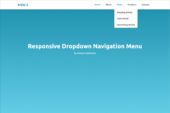

Here's a responsive dropdown navigation menu for Webflow. An easy cloneable that can be added to your Webflow site to get your navigation up and running quickly. Best of all it's already responsive and mobile ready.
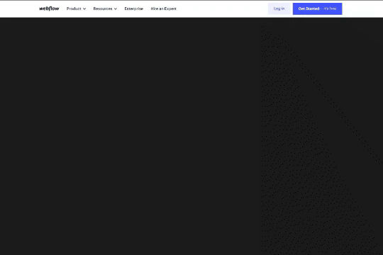
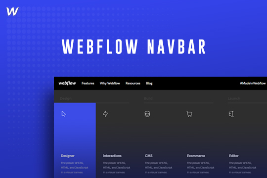
An amazing redesign and rebuild of Webflow.com's navbar and mega menu based on 2021! This mega menu features a full width menu with custom dropdowns, lists, custom icons and a grid layout. A great starting point for building out a mega menu in Webflow based on Webflow's beautiful menu design.
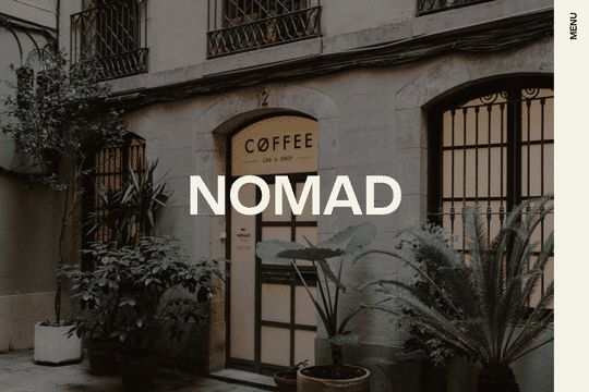
Add a unique and customized menu and navbar to your Webflow site. This example provides a unique feature of an image preview on link hover in the full page menu/navbar of your Webflow site.
Here are 8 navigation and menu designs perfect for your Webflow site. Various layouts all with responsive mobile friendly designs ready to go.
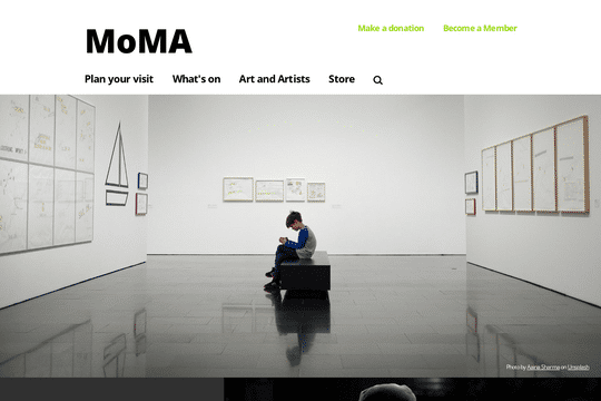

Here's a rebuild of MoMA's website navigation and menu bar. A great way to add a well designed and thought out navigation and menu bar to your Webflow site.
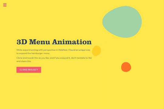

A fun way of creating a 3D animated menu in Webflow. Creating a 3D perspective effect when expanding the hamburger menu. This is a simple, yet effective way, to break out of the typical menu design.

A fun and clean hero and menu loading interaction in Webflow. When a user loads the page the text appears to load at different intervals, move around and then eventually load the entire page including the menu. There's a scrolling text marquee at the top of the page, parallax style scroll interactions, a menu with slide in interactions and much more. This was built using all native Webflow interactions and was built with the Finsweet client first framework and is fully fluid responsive.

Here's a rebuild of Webflow (2020) navbar and menu that you can add to your Webflow site. A perfect starting platform for building a dynamic navigation bar and menu to your Webflow site via this cloneable.

A clean menu and navigation dropdown design for your Webflow site. When a user hovers over the navigation bar the secondary menu drops down with a nice animation effect.
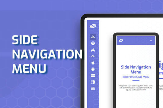

A side navigation based on Integromats dashboard design utilizing expand on mouse hover states with further hover over interactions and animations.
Another way of adding unique interactions and animations to the menu loading of your navbar. This demo showcases a grid menu animation on click. The menu wrapper consists of 2 grids, one 3x3 and another smaller 4x8 nested grid on the lower left corner. The panels scale from the bottom to the top and left to the right on click. The text also appears staggered motion from bottom to top. On close the text fades out and moves back down, and the menu panels scale back to 0 in a staggered way.

A well designed lateral menu animation built for Webflow. When a user clicks on the menu tab the entire menu opens up slowly sliding in to expand over the entire page. This was built using Webflow interactions with no custom code required. There's an interaction animation built for both opening and closing the menu.
This method showcases a 11x11 grid menu animation on click. The blocks in the grid appear in a specific, staggered to create this menu effect. The staggered effect plays in the opposite direction on the menu close. There are also micro interactions applied within the menu appeared.
A right side menu for Webflow that slides the menu in from the right hand side on click. This menu features all of the interactions required to create a Webflow menu. When the user clicks on the hamburger button the menu slides in from the right part way on the screen. There's a menu item hover interaction which has a highlight effect that grows on hover and then fades out on hover out.
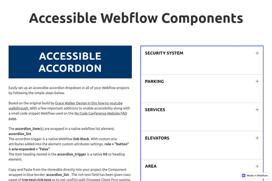

Accesible Webflow components library consisting of accordion, menu and an accessible Modal. This cloneable features three core components as well as a thorough description describing important accessibility characteristics and methodologies. This uses Finsweet's client first system and Webflow javascript snippets.
A clean and modern Webflow menu navigation design with hover over interactions/animations. A perfect cloneable to get your Webflow site started with a modern and aesthetically pleasing menu navigation. Upon hovering on a navigation link their's an interaction that shows a growing underline.
A full screen parallax menu/navigation featuring mouse interactions.


A unique menu/navigation video hover effect in Webflow. When hovering over a menu item the text enlarges and scrolls a larger description while playing a background video. A way to customize your menu and add stunning animations and interactions to Webflow.

A modern, full screen menu with a slide in animation as well as hover over text effects.
An expanding side menu that opens up on the right side of the page on click in Webflow. A fully designed with interactions menu/navigation bar that opens on the right side of your Webflow site.