


Cloneable tags
Description
The Dynamic Responsive Portfolio Grid cloneable is a template for showcasing a portfolio of work on a Webflow site. It features a grid layout that is responsive and adjusts to different screen sizes using Flexbox. The grid layout is dynamic and adjusts to the number of portfolio items being displayed, making it easy to add or remove items from the portfolio. The cloneable includes a tutorial video that provides step-by-step instructions on how to set up and customize the portfolio grid for your own site. The Dynamic Responsive Portfolio Grid cloneable is an excellent resource for designers and developers looking to create a professional, responsive portfolio on their Webflow site.
Related cloneables


Here's a way of adding a full page infinite scrollable and draggable grid in Webflow. This grid is fully draggable in ALL directions, horizontal and vertical as well as in any other direction. A perfect way of adding a unique design for portfolios, photography and much more in Webflow. This can also be used to tie into Webflow's native CMS system.
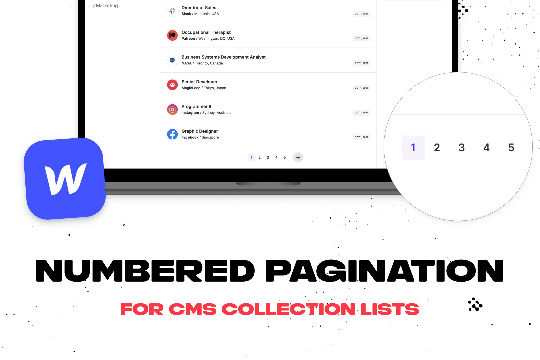

Add numbered paginations to your CMS collection lists via this small custom code snippet.
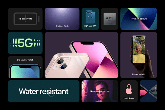

Add an Apple style keynote feature grid to your Webflow site. Video tutorial found here: https://www.youtube.com/watch?v=fAkGkF-w1gI
Easily add a grainy effect to your entire site. This uses a grain png that was on a Webflow site. You can create your own grains as well to change it up.
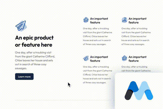

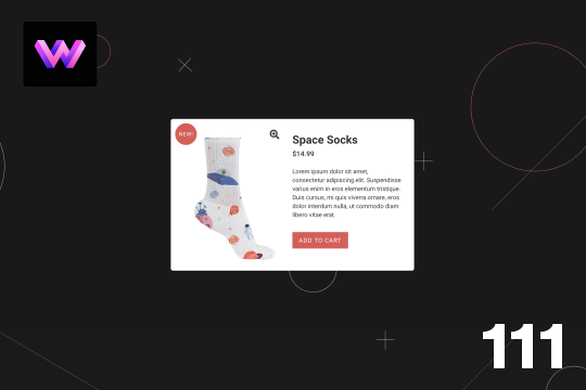
A beautiful product & feature grid section for Webflow. This product grid uses flexbox and grid and the icons are SVGs which inherit their color from the parent section.
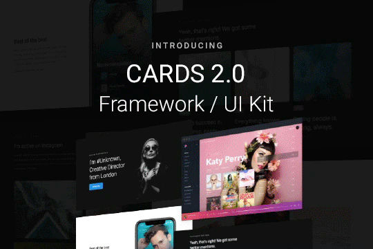

Cards 2 is an amazing UI kit and framework to allow you to quickly design and wireframe your next landing page using Webflow. There are over 100+ different prebuilt symbols and components included for hi-fidelity wireframing for any UI/UX designers. Create landing pages and designs faster with the Cards 2.0 UI kit directly in Webflow and ready to be published directly with code. This UI kit includes 50 new cards as Webflow components/symbols in both dark and light variations. 3 complete landing page designs in both dark and light. Symbols/components for both hero sections, features, testimonials, team, pricing pages, blog posts and more. These are responsive for all 4 breakpoints and all cards are offered in a Sketch file. This UI kit allows you to build your designs faster and begin the design process directly in Webflow.
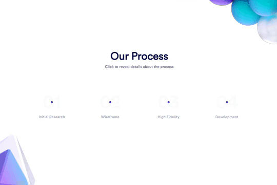

Here's a unique clickable process/steps section in Webflow. Whenever someone clicks on each step an interaction triggers that displays the number as well as further information about that specific step. Simply edit the content, update the interactions based on your requirements and enjoy a unique steps/process section on your site.


A simple way to create complex CMS grid layouts. You can define a layout for any item in the grid. You can make it multiple spans of columns and rows. You can also set columns and rows to the nth items as well as even or odd items.

More from author

Here's a full screen menu navigation with animations and interactions in Webflow. This is a great way to easily add a menu/navigation to your Webflow site. This was comprised of three components during the build process. First, an image wrapper with an image inside of it. Second, the blue background and third a right wrapper with the menu items inside of it. The image wrapper and right wrapper are both 50% width within the menu. The width of the blue background is 150% so it has a quicker animation as it scales in. By having separate wrappers inside of the menu wrapper the scaling effect can also apply to the image, and the blue background as well as individual animations to the menu items. The menu trigger also turns into a close icon on click and then back to the hamburger button.
An add to cart hover button animation for Webflow. When a user hovers over the Add to Cart button a shopping cart icon slides in from the right side. This helps users understand the action taking place on the button and helps add a new level of dynamic buttons to your Webflow site.
A unique product card animation on hover in Webflow. When a user hovers over a card the image shifts down, and a border appears with an animation, there's also a description of the card that appears as well. This animation effect was built entirely with Webflow's native interactions.
Showcase and feature your CTA by adding moving lines to the border in Webflow. Using this technique you can showcase anything that you want to draw the users eyes to by adding moving lines and a 3D hover rotation to products, cards and other important aspects on your site.
Easily add a grainy effect to your entire site. This uses a grain png that was on a Webflow site. You can create your own grains as well to change it up.
Here's a unique way to add transition animations to a full screen slider. Using both Swiper.js and a GSAP animation script.
Here's a product card with image zoom on hover for Webflow. When the user hovers over the product image it scales up and zooms so the user can see more information about the physical product. This was accomplished by placing the image div inside of a wrapper with an overflow hidden. When the user hovers over the image wrapper the image div scales up to double the size. Then with the mouse over element interaction the image moves in different directions when hovering over the image wrapper. This allows the user to hover around the image to see different parts.
A simple way to add a mouse scroll animation with a dot moving from the top to bottom. This is not a lottie file or gif, this is made with interactions and divs.