


Cloneable tags
Description
The Apple Style Feature Grid is a unique and stylish way to showcase features on your website. Inspired by Apple's keynote presentations, this Webflow cloneable allows you to easily add a grid of images and text to your site, creating a professional and visually appealing layout. Created by Nikolai Bain, this cloneable falls under the categories of Grid and Image, making it a versatile and functional addition to any website. With a video tutorial available at the provided link, it's easy to get started using the Apple Style Feature Grid on your own site. Whether you're looking to highlight your products or services, the Apple Style Feature Grid is a great choice for creating a feature section that stands out.
Related cloneables


Learn how to implement GSAP ScrollTrigger in Webflow. This tutorial and example cloneable showcases several different Scrolltrigger GSAP effects to turn your Webflow site into a dynamic powerhouse. When loading the page you are presented with a primary image and brand name. As you scroll down the brand moves from the bottom of the page to the top menu while reducing size. Further down the hero section appears and one of the words begins to move behind other text. Further down an image appears and then grows as you scroll further down the page. This shifts into the product section in which images appear with a parralax effect over certain words. This shifts into another product section and the backgrounds transition while the images still float above the text. Each section has a different background color/text color with the images continually scrolling above the text. This utilizes a lot of custom code, and utilizes Webflow's native CMS for products and items found on this page with CSS nth-child. You will need to add the custom code found in Page Settings to get this to work properly. Watch my GSAP Scrolltrigger tutorial for this project at https://www.youtube.com/watch?v=x-BVEhyYW50 Conceptual design for https://www.minimalgoods.co/

A fun GSAP text hover image span effect created for Webflow. When hovering over a specific text or link, images appear on the screen. Perfect for dynamic and playful interactions powered by GSAP. This script is powered by GSAP and you can find the custom code found in the page settings. This allows you to signify images that appear when a user hovers over a native Webflow text span item. This is also mobile friendly as the code allows you to set media resolution settings and customizing the effect on the non-selected text span. You are able to customize the easing, zindex position, colors and much more.


Are you looking to use Webflow tabs with a rich text CMS field? By default Webflow doesn't allow rich text fields to be placed in the tabs by default. This technique uses a bit of JavaScript so if you change the classes be sure to update the code within the page settings. The arrows in this demonstration are from Font Awesome and the colors can also be updated in the page settings.
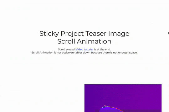

A great way to achieve a sticky Webflow effect for features, about sections or really anything in which the image becomes sticky in the viewport while the text still scrolls. As you scroll down the images are sticky while the text is scrollable, between each section there's an image transition effect. This effect uses no custom code and is all accomplished via Webflow's while scrolling into view interaction with the opacity and scale options.

Here's a way of adding a full page infinite scrollable and draggable grid in Webflow. This grid is fully draggable in ALL directions, horizontal and vertical as well as in any other direction. A perfect way of adding a unique design for portfolios, photography and much more in Webflow. This can also be used to tie into Webflow's native CMS system.


A smooth scrolling effect in Webflow that zooms into images as the page is scrolled. Perfect for adding smooth page scrolling and an image effect within your Webflow site.

Here's a way to add magnetic images to links on Webflow. The images appear as you hover over the links and stick to the mouse and overlay the text over the image. This method relies strictly on Webflow interactions and doesn't require any custom code or HTML embeds. The interactions use a combination of hide/show, scale, opacity text color and border color to work properly.


A fullscreen photo accordion with hover over interactions for Webflow. This Webflow cloneable features a unique full screen accordion powered by Webflow's native CMS system. When a user hovers over each card the card expands to show a larger image and detailed information about the accordion. While a majority of the effects were created with Webflow's native interactions there is some custom code that needs to be applied.

More from author

Add an Apple style keynote feature grid to your Webflow site. Video tutorial found here: https://www.youtube.com/watch?v=fAkGkF-w1gI

An interactive pop up modal for Webflow. This pop up modal includes close interactions, close on outside click as well as is fully responsive.

A simple, easy to implement pop up modal for Webflow. Instructions on how to make it display only once, rather than on every page load. View the full instructions here: https://youtu.be/uSgSoEQD1vs

A light themed, pop up email opt in modal for Webflow. A great way of adding an interactive, opt in pop up modal for your Webflow site. Build an email list faster and easier with this free cloneable.

A well designed centered pop up opt in modal for Webflow with premade gradients. This is a perfect way to add a pop up opt in modal to your Webflow site due to its premade gradient shadows which will make this modal window pop on any Webflow site.

An interactive dark corner opt in modal for Webflow with interactions for close. Easily add a corner style, email opt in pop up modal to your Webflow site that includes all necessary interactions for closing the modal.