


Cloneable tags
Description
The "Creating Contact Form" cloneable is a resource that provides a tutorial on how to build a contact form in Webflow. It includes a video walkthrough that demonstrates the process of creating a form and setting it up to receive submissions. This cloneable is particularly useful for those who are new to Webflow and want to learn how to create a functional contact form for their website. The tutorial covers all of the necessary steps to build a form, including adding form fields, setting up email notifications, and configuring form validation. By following the tutorial, users will be able to create a fully functional contact form in Webflow that is easy to use and customize to their needs.
Related cloneables
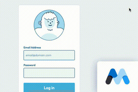


A fun login and sign up page for Webflow featuring a unique cartoon character that follows your mouse cursor. This is accomplished via 100% native Webflow interactions. The SVG was broken up into several parts, and added a hover over element interaction to the background and hover/in out interactions to the email, password and login fields. The rotating head effect is created by moving close-up elements slightly more than the background elements. For example, the nose moves 11px to the left or right, while the mouth only moves 9px and the face moves 6px while the body doesn't move at all.

Pop up contact form modal interaction for Webflow. A clean modal window appears with a contact form when clicking on the contact button. This contact modal form features all the native Webflow interactions required for a modal window in a fully responsive design.
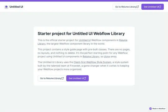

This is the official starter UI kit for the Untitled UI Webflow components library driven by Relume. This project contains a styleguide with all of the necessary pre-built classes. There are no pages, no layouts and nothing that you need to delete. This Untitled UI kit uses the client-first Webflow styling system. The styleguide features all typography, H1 headings, H2 headings all the way through H6 headings. This also includes the heading classes from xxlarge to xsmall, paragraphs, links, block quotes, unordered and ordered lists. You'll find the class text sizes such as text size large, text weights, text heights, text styles, color swatches, including error, warning and success color states. Background colors, text colors, shadows, UI buttons and all necessary elements, badges, badge groups, form elements such as inputs, dropdowns, checkboxs and radios. This is the complete Untitled UI styleguide kit to jump start your next Webflow builds.

Here's a way to create a multi-step Webflow form that includes a step counter, custom confirmation animations and custom checkboxes. A perfect way to filter leads, create long forms that are filled out, and segment your lists/clients.
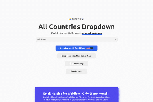

A way to add a dropdown with all the countries and flags to your Webflow site. There are several examples that utilize Nice Select, including flags, no flags and a dropdown only. You can copy-paste the custom code element with a select tag with all the countries in it. Note that this is achieved via JS and you won't be able to preview this within the WEbflow designer.
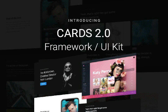

Cards 2 is an amazing UI kit and framework to allow you to quickly design and wireframe your next landing page using Webflow. There are over 100+ different prebuilt symbols and components included for hi-fidelity wireframing for any UI/UX designers. Create landing pages and designs faster with the Cards 2.0 UI kit directly in Webflow and ready to be published directly with code. This UI kit includes 50 new cards as Webflow components/symbols in both dark and light variations. 3 complete landing page designs in both dark and light. Symbols/components for both hero sections, features, testimonials, team, pricing pages, blog posts and more. These are responsive for all 4 breakpoints and all cards are offered in a Sketch file. This UI kit allows you to build your designs faster and begin the design process directly in Webflow.
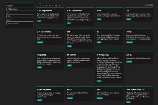

Using Mixitup to combine CMS lists into a single list and add both sorting and filtering to your Webflow site.
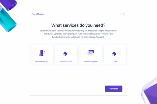
A beautifully designed, multi-step custom onboarding form perfect for your SaaS, web design or site which requires a multi-step form. This is a complete onboarding form page design that allows for multi-step progress via a bit of Javascript. You will find the necessary JS and CSS files within the pages custom code settings. One set of code allows the form to use the arrows for the next and previous form pages. This form also features a unique range slider which was used for the date. This can be customized to your own requirements but is a well designed, multi-step onboarding form that allows you to break down long questionairres or onboarding forms into small, bite size pieces.

More from author

Here's a full screen menu navigation with animations and interactions in Webflow. This is a great way to easily add a menu/navigation to your Webflow site. This was comprised of three components during the build process. First, an image wrapper with an image inside of it. Second, the blue background and third a right wrapper with the menu items inside of it. The image wrapper and right wrapper are both 50% width within the menu. The width of the blue background is 150% so it has a quicker animation as it scales in. By having separate wrappers inside of the menu wrapper the scaling effect can also apply to the image, and the blue background as well as individual animations to the menu items. The menu trigger also turns into a close icon on click and then back to the hamburger button.
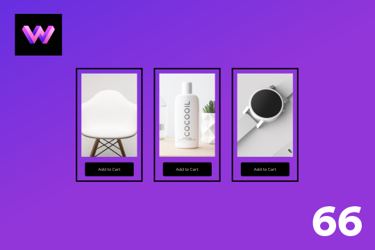
An add to cart hover button animation for Webflow. When a user hovers over the Add to Cart button a shopping cart icon slides in from the right side. This helps users understand the action taking place on the button and helps add a new level of dynamic buttons to your Webflow site.
A unique product card animation on hover in Webflow. When a user hovers over a card the image shifts down, and a border appears with an animation, there's also a description of the card that appears as well. This animation effect was built entirely with Webflow's native interactions.
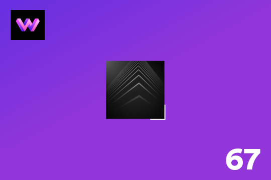
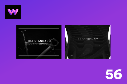
Showcase and feature your CTA by adding moving lines to the border in Webflow. Using this technique you can showcase anything that you want to draw the users eyes to by adding moving lines and a 3D hover rotation to products, cards and other important aspects on your site.
Easily add a grainy effect to your entire site. This uses a grain png that was on a Webflow site. You can create your own grains as well to change it up.
Here's a unique way to add transition animations to a full screen slider. Using both Swiper.js and a GSAP animation script.
Here's a product card with image zoom on hover for Webflow. When the user hovers over the product image it scales up and zooms so the user can see more information about the physical product. This was accomplished by placing the image div inside of a wrapper with an overflow hidden. When the user hovers over the image wrapper the image div scales up to double the size. Then with the mouse over element interaction the image moves in different directions when hovering over the image wrapper. This allows the user to hover around the image to see different parts.
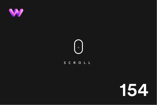
A simple way to add a mouse scroll animation with a dot moving from the top to bottom. This is not a lottie file or gif, this is made with interactions and divs.